Built Like the Bunkhouse, Dressed Like the Lodge: How Yellowstone's Architecture Can Shape Your Entire Wardrobe
If you've ever watched an episode of Yellowstone and found yourself staring at the scenery as much as the drama, you're not alone. The show's locations aren't just pretty — they're carefully constructed visual statements. The grand lodge radiates old-money authority. The stable grounds carry a working-class grit that feels earned, not performed. Even the open pastures communicate something about scale and permanence that the Dutton family wears as casually as a broken-in flannel.
Here's the thing: those same architectural signals can inform how you get dressed in the morning. Color, texture, silhouette, layering — it all maps back to what the show's set designers already figured out. The Dutton estate is essentially a masterclass in cohesive visual identity, and your wardrobe can take notes.
Start With the Lodge: Earth Tones as a Foundation
The main lodge at the Dutton ranch is built on a palette that feels like it grew out of the Montana soil. Deep charcoals, warm taupes, raw umbers, and the occasional flash of muted sage — these aren't trendy colors. They're permanent ones. They've been around since the first settlers started stacking stone, and they'll be around long after fast fashion moves on to the next thing.
If you're building a wardrobe with any kind of western foundation, this is where you anchor it. A charcoal waxed canvas jacket. A camel-toned shearling coat. A deep espresso leather vest. These pieces don't compete with each other because they're all pulling from the same source material — the land itself.
The lodge also uses contrast deliberately. Dark timber against pale stone. Rough-hewn beams against polished floors. In wardrobe terms, that translates to pairing a structured, heavier outer layer with something softer underneath. Think a heavyweight denim or canvas jacket over a worn-in thermal henley. The contrast is what creates visual depth, and depth is what makes an outfit feel considered rather than thrown together.
The Stable Grounds: Texture as a Design Language
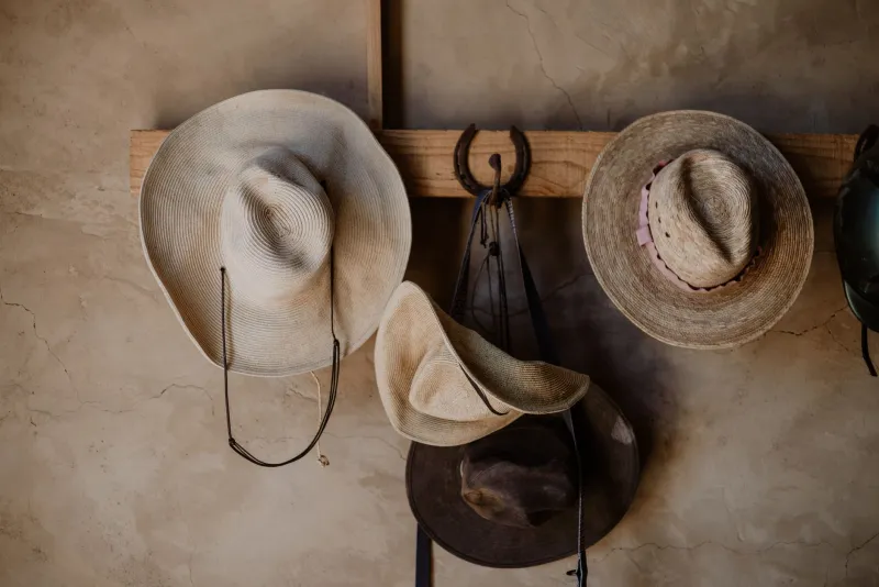
Walk through the Yellowstone stable scenes and pay attention to what surrounds the characters — weathered wood, braided rope, oiled leather, rough-spun wool. Every surface has a story written into it by years of use. That's the aesthetic of function: things that look the way they do because they've actually been used for something.
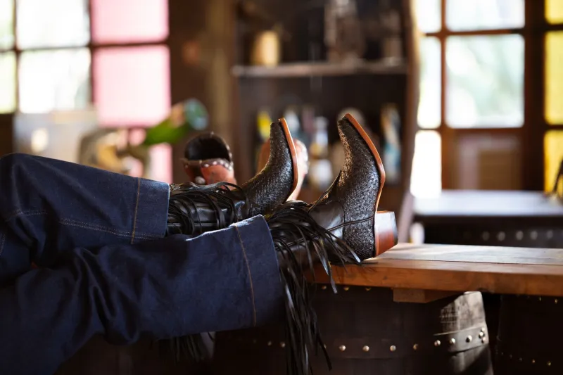
In western wear, texture is your most powerful tool. A smooth, plasticky synthetic jacket might keep you warm, but it doesn't communicate anything. A waxed canvas barn coat with worn-down elbows? That says something. Distressed leather boots with a heel that's been resoled twice? That says something too.
When you're shopping for outerwear especially, run your hands over the material before you commit. Does it have weight? Does it feel like it could hold up against a Montana winter or at least a Chicago November? Texture isn't just about how something looks — it's about the implicit promise that the piece makes about its own durability.
Layering is the stable-ground move done right. Start with a base layer that breathes — a cotton or merino wool long-sleeve. Add a flannel or quilted vest for mid-layer warmth. Finish with a canvas or leather outer shell that can take some weather. That's not just practical. That's architectural. You're building something with structure, the same way a good barn is built.
The Open Range: Silhouette and Scale
One of the most striking things about Yellowstone's outdoor scenes is how the landscape makes the characters look — small against the mountains, but never diminished. The way the show is shot, the characters seem to belong to the land rather than just standing in front of it. That sense of scale is worth thinking about when it comes to silhouette.
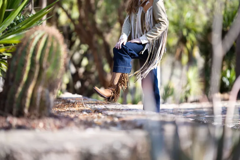
Western style has never been afraid of proportion. Long dusters that hit at the calf. Wide-brimmed hats that take up real estate. Boots with a stacked heel that adds two inches of presence. These aren't accidental choices — they're about commanding space in a landscape that could easily swallow you whole.
For everyday dressing, you don't need to go full trail boss. But leaning into slightly roomier cuts, longer hemlines on your outer layers, and boots with some actual heel can shift how you carry yourself in a room. A longline canvas duster over straight-leg jeans reads as effortlessly authoritative in a way that a cropped puffer jacket simply doesn't. Scale matters.
The Dutton Color Hierarchy: Dressing by Room
Here's a useful framework for thinking about your wardrobe the way the show thinks about its interiors. Imagine three zones:
The Lodge (Power Pieces): These are your investment items — the coat, the boots, the belt. Rich, dark, authoritative tones. Chocolate brown. Charcoal. Oxblood. These pieces anchor everything else and should be bought with longevity in mind.
The Bunkhouse (Workhorse Layers): Flannels, henleys, quilted vests, denim. Warmer tones — mustard, rust, slate blue, forest green. These are the pieces that get worn hardest and should feel relaxed without looking sloppy.
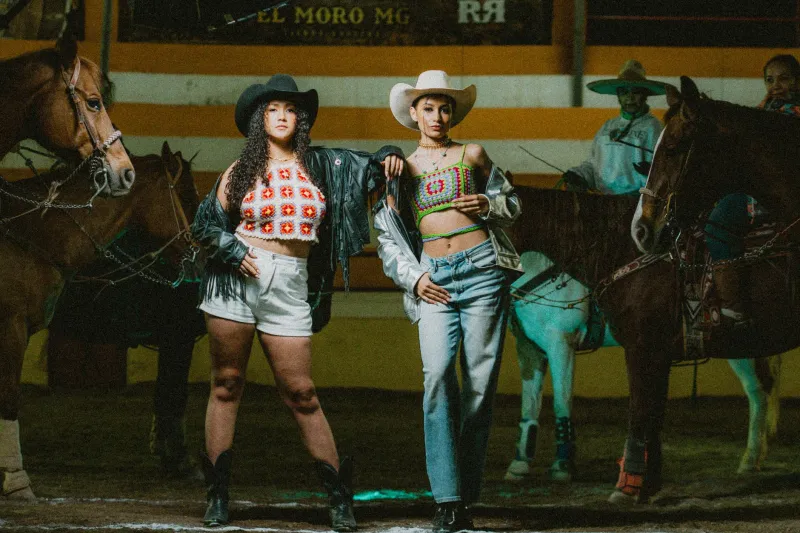
The Pasture (Accent Pieces): Bandanas, hat bands, belt buckles, fringe details. This is where you can introduce something unexpected — a pop of turquoise, a pattern, a bit of worn-in red. Keep it small. The land is the star; the accent is just what catches the eye.
When you dress by this hierarchy, your outfits start to feel intentional in the same way the ranch feels intentional. Everything has a place. Nothing is fighting for attention.
Putting It All Together: Wearable Architecture
The Dutton estate works as a visual statement because it's consistent. Every element — from the materials used in construction to the way the furniture sits in a room — communicates the same thing: this family has been here a long time, and they plan to stay.
Your wardrobe can do the same thing. Not by copying the show's costumes directly, but by borrowing its logic. Anchor with earth tones. Build in texture and layering. Respect proportion. Invest in pieces that look better with age rather than worse.
The most powerful thing about Yellowstone's visual language is that it never feels like it's trying. The lodge doesn't announce itself. It just is. That's the energy worth chasing — a wardrobe that feels so settled into itself that it stops being something you think about and starts being something you simply wear.
That's the Dutton estate aesthetic. And honestly? It looks just as good on a Tuesday morning in Denver as it does on a Montana hillside at golden hour.